CandyTattoo
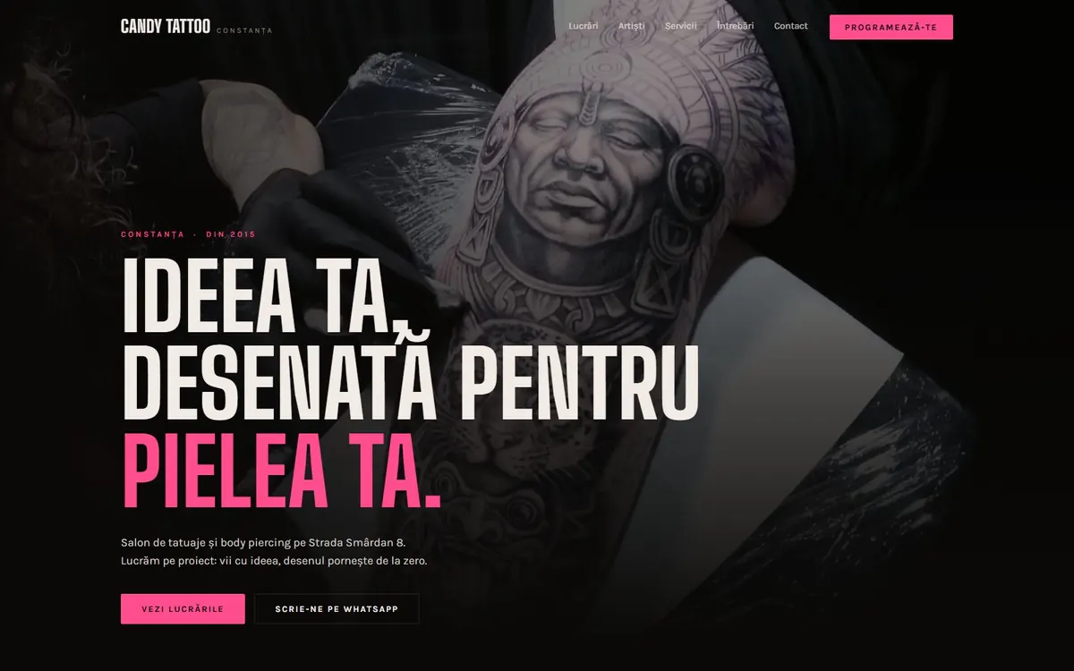
Dark, bold, with booking one tap away. The artists’ portfolio does the selling; the site just puts it in the spotlight.
- Field
- Tattoo studio
- Where
- Constanța
- Delivered
- Design · Gallery · Bookings
- Designed first for
- the phone

The challenge
Tattoo clients decide on the portfolio. The site wasn’t meant to sell with words, but to let the work speak and make booking easy.
What we did
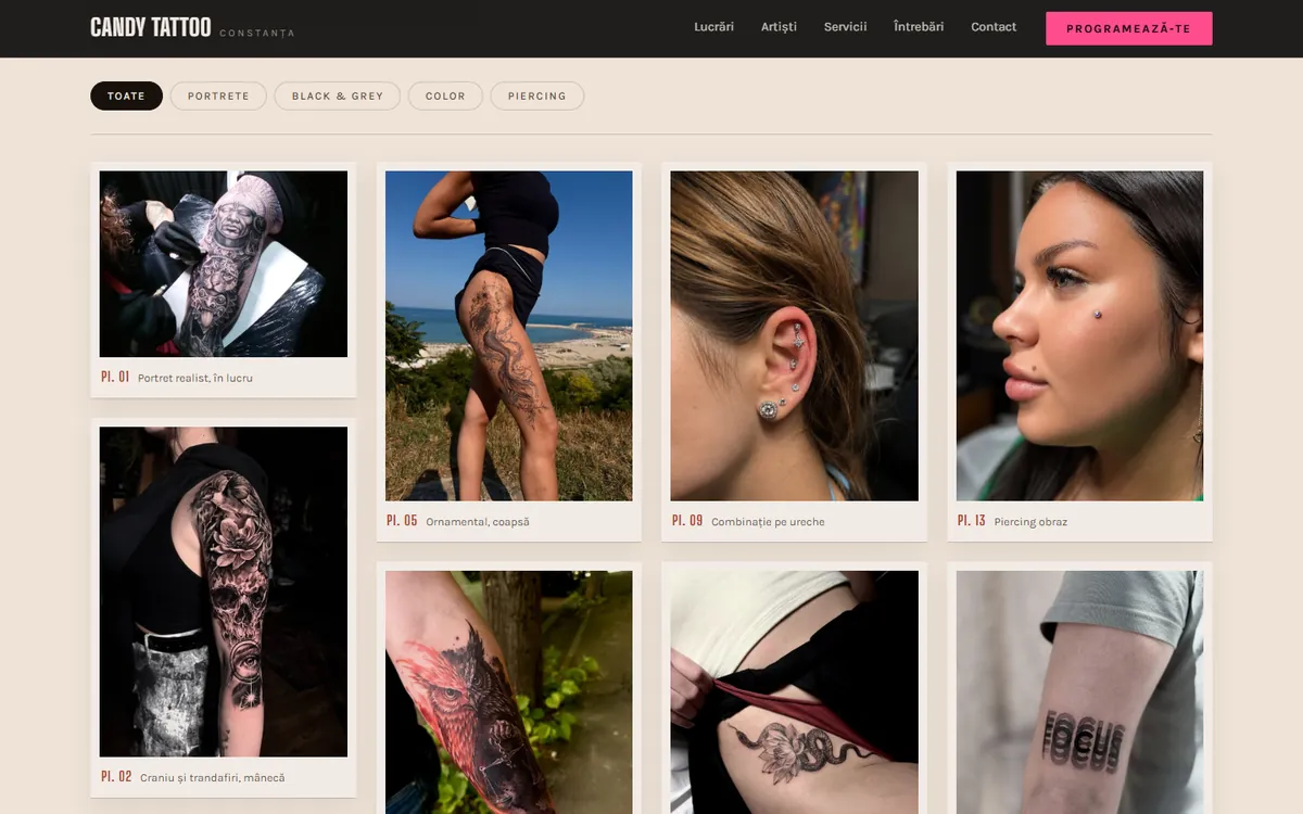
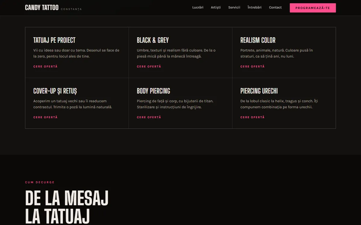
We made a dark, bold site with a gallery by style (black & grey, colour, piercing), the team who draws, services explained briefly and the path “from message to tattoo”. Booking is one tap away.
How it lookson desktop.
On the phone
Where itgets decided.
- 01The gallery is built for the thumb: filter and swipe.
- 02The booking button is always at the top.
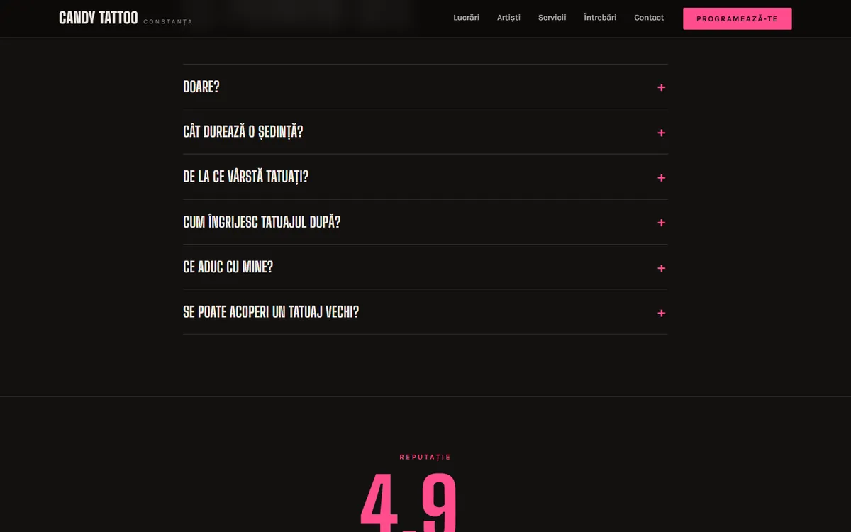
- 03Answers open in place, no new pages.
What makesthe difference.
01
The work does the selling
Photos get all the space; the copy just puts them in the spotlight.
02
From message to tattoo
The steps are explained up front, so a first tattoo isn’t scary.
03
The hard questions
Pain, duration, aftercare: the answers are on the site, not just in DMs.
Want onelike it?
We reply within one business day.
WhatsApp: +40 732 796 621 (opens in a new window)
E-mail: alex.serban@opticaldesign.ro
Digital card: opticaldesign.ro/c/alex (opens in a new window)